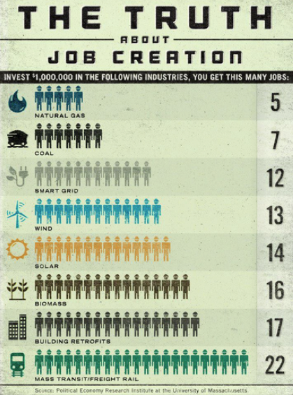
A graphic floating around Facebook called “The Truth About Job Creation” (see below) makes it seem as if the government should be investing in renewable energy and other projects favored by “green” groups. The graphic shows that investing $1 million leads to only 5 jobs in the natural gas sector, but 14 in solar, and so on. Such “demonstrations” are completely irrelevant though for economic health. Government support of “green” projects raises energy prices and actually makes the average worker poorer.
The fundamental problem with the graphic is it assumes that mere job creation is the goal. But in reality, the purpose of having jobs is to transform resources into goods and services that consumers value. Because the graphic offers no information on how much these workers produce in various sectors, it is largely an irrelevant bit of trivia.
Related to this problem is that the graphic doesn’t make any accounting of what kind of jobs lie behind the figures. For example, do the representative 5 jobs in the natural gas sector pay the same wages as the 22 representative jobs in mass transit? We have no idea, and so again, the graphic by itself is almost completely devoid of significance.
If maximizing the creation of jobs per dollar invested is the goal, then we can trump the above figures. For example, the government could pay 10,000 people $100 each to mow lawns for a day. That would (temporarily) “create” 10,000 jobs for a $1 million investment. Yet the people who created this graphic wouldn’t surely admit that putting up 10,000 workers in the figure next to “Lawn Mowing” would be silly.
Yet another problem with the implied policy recommendations with this graphic is that the government is terrible at “job creation,” particularly in the area renewables. The famous Calzada et al. study showed that the Spanish government’s massive investments in this area took 2.5 times as much money per job “created” as the private sector used on average. More recently, Obama Administration officials claimed that their stimulus package cost $862 billion and “saved or created” about 3 million jobs. That works out to $287,000 per job, even if we concede their numbers. Are those 3 million workers, in general, making anywhere near that kind of money? Of course not, and this just shows how grossly inefficient it is to “create” jobs through the federal government, even on its own terms.
In a market economy, wages and prices adjust so that labor is deployed in a way that best satisfies the desires of workers and consumers. Some industries, such as offshore oil drilling, are very capital-intensive, meaning that there are relatively few workers operating a large amount of machinery and equipment. Other industries, such as hair styling, are relatively labor-intensive. Dividing the total number of workers in an industry by the total amount of invested capital will therefore give a wide range of numbers, but these figures are virtually meaningless. We wouldn’t be doing workers or consumers any favors by taking investment out of offshore drilling and putting it into hair salons, since the market has already deployed the available capital and labor in ways that balance consumer desires for energy and stylish hair.
As an economy progresses and capital accumulates, there is a tendency for fewer workers to remain in any particular operation. For example, in 1850 a large portion of the American workforce was devoted to agriculture. That percentage drastically declined in the ensuing decades. Yet this destruction of “farm jobs” didn’t mean the United States economy was in free fall. On the contrary, the ability of fewer and fewer farm hands to grow more and more food, meant that workers were freed up and able to start producing other goods and services. This is the process by which worker productivity and standards of living rise over time.
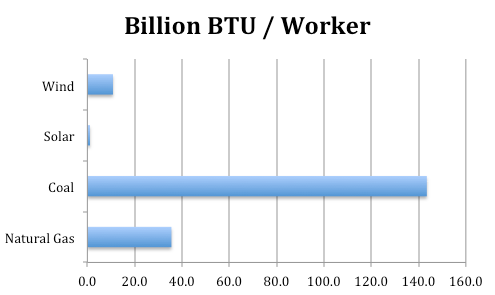
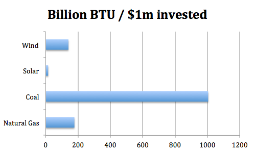
Notwithstanding the above analysis, there is obviously something very compelling about seeing a cute graphic. In that spirit, we’ll provide two of our own. We can go to the Energy Information Administration to get the total amount of energy produced (measured in British Thermal Units or BTUs) from various sources in 2010. Then this site provides a rough approximation of the total employment across various energy types, though its data come from several sources (not necessarily using the same methodology) and should not be taken with a grain of salt. Combined with the information in the graphic above, we can generate the following two charts:
To reiterate, the above charts shouldn’t be taken too seriously, as we are relying on ballpark figures from several sources, including the original “Truth About Job Creation” graphic (which itself seems to be based on this PERI report). Our point with the above two charts is merely to show that framing the issue in terms of energy produced shows the superiority of fossil fuels, and also why the “workers per $1 million invested” original figures are relatively low in these fields. Namely, the workers in the fossil fuels sector are so productive that it doesn’t take that many of them to produce large amounts of energy, and that’s partly why there are fewer workers associated with a given investment of capital.
If it wants to promote the growth of productive, sustainable, high-paying jobs in the energy sector, the federal government merely needs to reduce regulatory barriers and let the market operate.


